
First-screen orientation
Can a visitor identify the site, language, sign-in state, primary navigation, and exit path without opening a hidden menu?
A small screen can hide important navigation, force risky mis-taps, or show a different task path from desktop. This protocol records the same public checks in the same order before mobile UX influences a ranking.
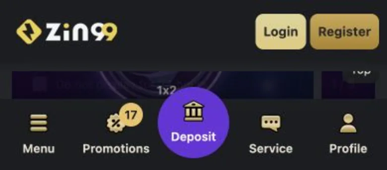
We repeat one public task path at mobile and desktop widths, record which controls remain visible, measure whether touch targets can be used without mis-taps, switch available languages, interrupt the path once, and confirm the user can return safely. A screenshot documents the observed state; it never substitutes for the test log.
Can a visitor identify the site, language, sign-in state, primary navigation, and exit path without opening a hidden menu?
We record how many visible steps are needed to reach help, profile, terms, responsible-play information, and the page the visitor intended to inspect.
Controls should have enough size and spacing for a finger, with no overlapping tap areas or important actions placed beneath sticky overlays.
We switch every public language offered and note mixed-direction text, truncated labels, untranslated controls, or navigation that moves without explanation.
After rotating the device or leaving and returning, the visitor should understand what state remains and how to back out without repeating a sensitive action.
| Signal | Pass | Editorial note | Score blocked |
|---|---|---|---|
| Navigation | Important destinations remain labelled and reachable. | A path exists but needs an extra menu. | A needed destination disappears or traps the visitor. |
| Touch targets | Controls have clear boundaries and usable spacing. | One secondary control is cramped. | Primary actions overlap or create repeated mis-taps. |
| Mobile/desktop parity | Core information and safety links are equivalent. | The order changes but meaning remains. | Material terms or help routes exist on only one viewport. |
| Recovery | Back, close, and retry states are understandable. | The state resets with a clear message. | The interface repeats or obscures a sensitive action. |
The screenshot confirms only that a specific public mobile layout was visible during this test. It does not prove that logged-in screens behave the same way, that a transaction will complete, that a stated licence applies in Egypt, or that the product will remain unchanged. Those claims need separate evidence and dates.
No. Visual polish is only one observation. We separately check task completion, touch targets, language consistency, interruption recovery, public operator claims, and support paths before a review can use a positive usability finding.
A responsive layout can change navigation, visible content, form order, and error recovery. Testing both catches information or controls that disappear on one viewport and prevents a desktop-only review from describing the mobile experience inaccurately.
No. It is a cropped public-interface observation used to explain the test method. It does not verify account safety, payment speed, licensing, legality, or the result of any transaction.
The live site may have changed since the screenshot. Open it only if you want to reproduce the public navigation observation; do not treat the link as a test result.
Open the official public interface